UI/UX Principles in Mobile App Design: The Backbone of Successful Apps

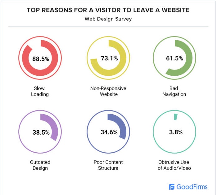
Apps must have a great design that draws people in and keeps them using it again and again. App design has many parts, like user interface (UI) and user experience (UX) principles. These are key for apps to work well and give people a smooth, fun experience when using them. UI design’s goal is ensuring the app looks nice, is easy to use, and works intuitively. A study conducted by GoodFirms reveals that 73.1% of web designers attribute visitors leaving a website primarily to its non-responsive design. Let’s look at app design, its process, benefits, core principles, and how to make feature-packed yet user-friendly apps.

Understanding Mobile App Design
—————————————-
Great mobile app design comprises many aspects. It makes apps visually appealing yet simple to navigate. It means intuitive controls and smooth user experience. Underlying design principles ensure seamless use and meeting users needs effectively. Good UI/UX boosts engagement, satisfaction and keeps people coming back.
Talking about mobile app design refers to how an app appears, feels, and works. App designers blend visuals like colors, shapes, layouts with how it responds to touch or clicks. They ensure it’s simple to find features.
App designing is about meeting users’ needs. It requires great visuals and functionality. It involves understanding users, prototyping, and testing. Small details like button taps or crash prevention are vital. Ultimately, it creates an appealing and efficient app experience.
The Mobile App Design Process
—————————————-
Making an app is a lot like taking a trip. First, you must know the end goal. What’ll you need on the way? How’ll you get there? That’s what mobile app design does. It gives you a map from an idea to an app people love.
- First step is research. This is like picking where to go. You learn about who’ll use your app. What problems do they have? Doing research makes sure your app is valuable.
- Next up is wireframing. These are basic plans for your app. They show where buttons and features go. But no colors or graphics yet. Wireframing plans the easiest path for users.
- Then, prototyping Now you build a simple model. It’s like a test drive for your app. Prototypes let you and users test the design and functions. You can fix bumps early.
- Last step is testing. This isn’t just a quick check. You thoroughly test if everything works right. Real users try your app. You get their feedback. You tweak the design as needed. Testing ensures a smooth ride when you launch.
The mobile app design process converts a great concept into a successful application.
The Benefits of Investing in Mobile App Design
—————————————-
Spending on app design plants a seed that blooms into a robust, thriving enterprise. The advantages facilitate business growth in the digital realm. Let’s explore these uncomplicated, easy-to-grasp points.
- Firstly, thoughtful app design increases user engagement with your app. When an app delivers ease and pleasure, users tend to continue utilizing it and even recommend it. Envision your favorite app’s delight – that’s the aim.
- Secondly, outstanding design strengthens and solidifies brand recognition. When users enjoy a positive app experience, they associate those favorable emotions with your brand. Consequently, they’re likely to revisit the app and other offerings.
- Thirdly, exemplary mobile app design can directly elevate sales or conversions. If your app simplifies users’ searches, they’re likelier to purchase or subscribe.
- Additionally, design-focus improves the overall user experience, boosting satisfaction and retention. Satisfied users commonly post positive reviews, attracting more users.
- Ultimately, investing in app design transcends aesthetics; it cultivates an environment where users feel gratified, yielding a suite of business benefits: heightened engagement, fortified loyalty, and increased conversion rates.
Key Principles of UI/UX Design
Creating a likable app involves following key design principles. Let’s explore these principles that help craft enjoyable mobile apps.
- First, simplicity stands out. A simple design allows users to find what they need with ease. It’s like a tidy room where everything is accessible, unlike a cluttered space. Keeping the design uncomplicated lets users navigate smoothly, ensuring a pleasant experience.
- Consistency is also crucial. Imagine books changing page number styles or doors opening differently each time. Confusing, isn’t it? App consistency means uniform fonts, colors, and button styles. This familiarity helps users feel at home, knowing what to expect as they navigate.
- Intuitiveness is vital too. An intuitive app feels natural to use, almost reading user’s minds. It anticipates user needs and provides options logically. This could mean a prominent search bar or accessible checkout button. When intuitive, apps become nearly effortless to use.
- Finally, accessibility ensures everyone, including those with disabilities, can use the app. This involves designing with contrast for visual impairments, providing text alternatives for images, and enabling voice commands or gesture navigation. Making an accessible app opens it to a wider audience, allowing everyone to enjoy it.
These design guidelines form the foundation for creating apps that look great and work well. By following these rules, designers can make apps users will love and keep using.
How to Ensure Your App is Feature-Packed Yet User-Friendly?
—————————————-
Ensuring your app has advanced features while staying user-friendly is doable. Have a look at some of the tips:
- First, focus on features users truly need. Include features that make life simpler or more fun. It’s like packing for a trip – bring what you need, but don’t overload.
- Next, organize your app for a natural flow. Place key features where users can easily find them, like putting kitchen tools within reach. This prevents frustration when users look for what they need.
- Keep it straightforward. Too many extras can confuse an app. It’s better to have a few well-designed features rather than cluttering the experience.
- Also, listen to users. If they struggle with features or find them useless, be open to changes. This could mean removing something, tweaking how it works, or adding in-app help tips.
Selecting the Right Software Development Partner
Choosing a top Flutter app development company is like picking a teammate for a long trip. You want someone you can count on, skilled, and ready to work with you.
- Look for a firm that has created user-loved, well-designed mobile apps. They should have an insightful portfolio you can view to assess their app quality.
- Experience matters a lot. A partner with mobile app know-how can guide you from idea to product. They must stay up-to-date on tech trends to keep your app feeling fresh. Their design and coding should meet high standards.
- Quality and innovation are musts. Ask how they ensure user-friendly apps that solve issues users face. How do they tackle challenges during the app development? A great app development partner is more than a vendor – they’re a collaborator invested in your business goals.
Conclusion: Creating Standout Apps
Great apps start with smart mobile design. Following UI/UX principles, taking time in the design process, and prioritizing user experience lays the groundwork. But the journey doesn’t stop. Partnering with a top mobile app development company, ensuring security and scalability, and continually enhancing through testing and updates keeps apps relevant and beloved. The goal is building apps exceeding basic needs, offering engaging, efficient, enjoyable experiences. Focusing on these elements helps businesses navigate the app landscape successfully, turning good ideas into great apps users love.


