Reasons Why Should You Make A Mobile-First Web Design in 2022?

What’s the Big Deal about Mobile First?
In 2020, 53 percent of all Indians were using their mobile phones to connect to the internet. 96 percent of mobile internet users were expected in 2040, indicating significant growth in mobile internet usage.
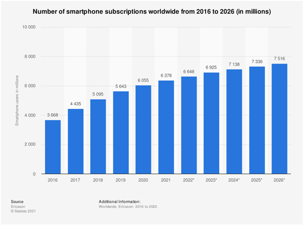
Today, there are more than six billion smartphone subscribers worldwide, and this number is projected to grow by several hundred million in the next few years. There are the highest numbers of smartphone users in China, India, and the United States.

Mobile-first design: what does it mean?
Is your website the same across all displays? Yes, it can be responsive anywhere customers access the website. However, before doing that, you need to code it responsive for mobile devices to look good on them.
Many web design agencies have experience creating mobile-friendly websites. Your website’s visibility and ranking on search engines will improve as a result of a mobile-first design. Consequently, your revenue and profit will increase. Your company’s or your business’s success depends on a mobile-first design and high responsiveness.
Mobile-first design advantages
- Reaching a large majority of users – People often use their mobile phones to search the results, so most of their user base has a high potential to reach their customers through their mobile phone, reaching the customer where they are is the best way to ensure your brand gets exposure.
- Content with high priority – Web designers must prioritize information when designing for mobile devices. Considering the limited amount of space available, you should include only the most important content. As a result, your website will load faster and users will not be distracted by unnecessary fluff. It will simplify, streamline, and improve the efficiency of your website designs. A mobile-first design will make you a more effective web designer.
- Better UX by being more responsive – Mobile sites are very different from desktop sites in how users interact with them. Building a mobile-friendly website lets you create a mobile-friendly user experience that’s not just adapted from the desktop. Your conversion rate will rise if you provide a better user experience, as more users will visit your website.
- Load times are faster – The content on a page can be limited and loading times sped up if you start with a mobile design first. Faster load times will not only boost conversions but also help you rank higher on Google. Faster load times are a significant ranking factor!

Design Techniques
- Simplicity is key
- Keep an Eye on Your Navigation Bar
- Place conversion buttons, forms, link strategically
- Include mobile testing in the testing process
Four tips for creating a mobile-friendly website
If you follow these tips, you won’t have a hard time designing your website for mobile.
1. Simplicity is key
Your website design is no exception to the rule that simplicity will always get you better results than complexity in most cases. Mobile devices, however, are more challenging to design for, as they have tiny screens, and users surf on them with a clear goal in mind. The purpose of a simple and clear website design is to help them find and view what they are looking for quickly and easily.
Only display the essential elements and do not overwhelm your mobile users with extraneous content such as pop-ups or ads. Don’t overdo the visuals on your website. Include only the things they’re there for.
2. Place conversion buttons, forms, links strategically
Design your website for mobile devices with the idea that your users will be using their fingers rather than Use larger fonts for your CTAs so that they are easier to read and click your CTAs. Make sure your CTAs appear right away on the first load of your website; this will ensure your CTAs are visible right away.
Make sure your website is easy to use on mobile devices by using big, clear buttons.
3. Keep an Eye on Your Navigation Bar
Navigation is essential for the success of any website; it enables users to move from one page to another with ease. Poor navigation can hinder your website’s success, and you will lose a lot of visitors.
You should design your website so that it is simple for users to navigate, regardless of whether it is intended for desktop or mobile users. If you’re designing a mobile navigation bar, you’ll need to reduce the number of options to the bare minimum and make the secondary elements easy to reach. How do you do that effectively? A hamburger menu is the easiest way to accomplish this.
4. Include mobile testing in the testing process
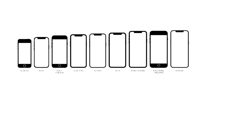
Our websites should be tested on different mobile sizes, as we all know. You should not just test your website once; you should test and retest it regularly across multiple platforms.
What’s the reason? It is not enough to have a website that looks good on one device; it must also appear well on other devices.
Do you want to know how to test the responsiveness of your website across a range of screen sizes, browsers, and resolutions? LT Browser is the easiest tool to use to check your website’s mobile view on different screen sizes and resolutions – with it, you can quickly check your site’s mobile view. LT’s browser can view any resolution on any device – iPhone, iPad, Samsung, or even MacBook!!
Different mobile browsers are used by different visitors, so you should consider them as well. Chrome users on iPhones, for example, may behave differently than Safari users.
In conclusion
As mobile phones make it easier for people to find answers to questions, to get services or to purchase products, progress in technology helps mobiles to be smarter every day, mobile phones take on more and more roles in our daily life
When you want to make your online business more successful, focus on optimizing mobile responsiveness for mobile phones, which has a large user base
Fun fact: 80% of the persons check their phones before waking up from the bed
If you need to know more about mobile-responsive feel free to contact mind made- web design agency


