How to Find a Good Newsletter Design Agency in Houston?

There are numerous ways in which humans communicate with each other; normally, the communication carried among people is direct; however, there also are some ways that allow us to communicate indirectly, and one such way is design. Just like we speak through different languages, the things we make speak through design. Every time someone creates something or designs something, they communicate through the art they have created.


Importance of Design in Our Lives

Design is such an important part of our lives that everything around us and everything we use is designed in some way. A mistake many people make is that they believe that design is only to make things pretty or has only to do with art; however, that is not true because the design is as much an art as it is a science. Since design is a calm and calculated process, it offers something for everyone.

Something well-designed not only projects a message to people but also can change their opinions; art and design are often used to make people think differently and inspire them. It also can make people feel a wide range of emotions and even improve their lives.

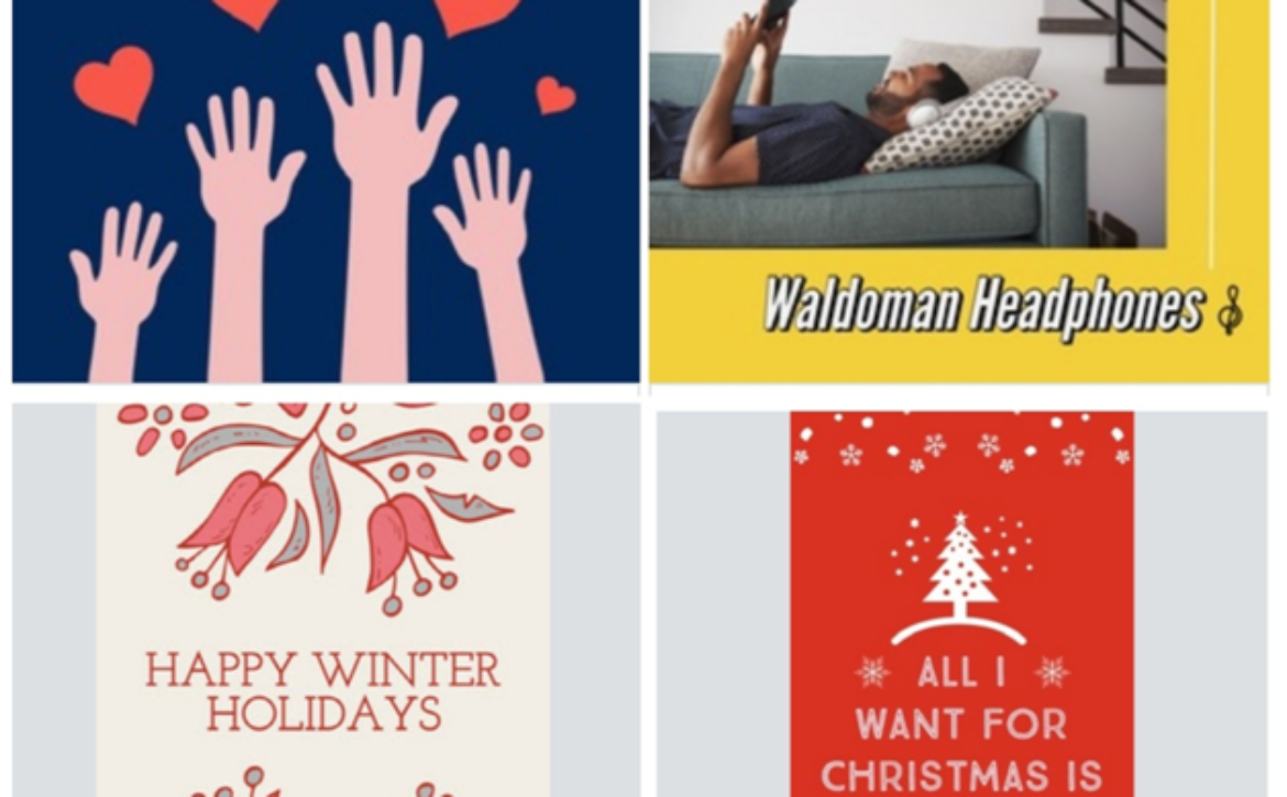
Today we live in a digital era, and the majority of communication that is carried out these days is through digital means. Since design plays such a massive role, we have found numerous ways to incorporate design into our digital lives. This fusion of design with digital media is also known as graphic designing, whether it be eye-catching websites, stunning posters, artistic logos, or creative magazines; graphic design is almost everywhere. However, the graphic design we will discuss today is newsletter design.


Newsletter Design and Its Importance

A newsletter is an email sent out periodically by a person or a business to spread information regarding the topic the user has signed up for. Newsletters have become an extremely valuable part of businesses; they are often used as a marketing tool to persuade clients. However, the design must also be eye-catching to make a newsletter persuasive. Most people often ignore newsletters; to ensure they read them, the newsletter must be well-designed.

Since information is abundant, most people only bother reading a newsletter to gather information. The newsletter must be designed so that it does not only look good, but the information is also structured for easy skimming.


Finding a Good Newsletter Design Agency

If you are someone who has realized that the newsletters that you have been sending have yet to be able to get the audience engaged, then it’s time that you get it designed properly. The easiest way to do it is by finding a good design agency and letting them do the job; however, finding a good newsletter design agency takes work. So, if you are facing this dilemma, here’s a guide to finding a good newsletter design agency.


1. Decide on Your Budget 

Budget plays a massive role in choosing a newsletter; even before starting your research to find the best newsletter design agency in Houston, you must set a budget to know what you can afford. There are all kinds of design agencies out there, and each agency has its packages and pricing; by setting a budget, you would not only be self-aware, but it would also help you approach the agencies in your range. However, it is also recommended that if you find an agency that is out of your range, you must try negotiating with them.


2. Do Your Research

After setting your budget, the first thing that you must do is a thorough market search. The easiest way to do this is by checking different design agencies on the internet, you would find a website of almost any design agency, and the website itself speaks a lot. A good newsletter design agency always has a stunning website because most agencies excel in different designs.

By going online, you can also read reviews from different clients of a specific agency and have a more detailed understanding of how the agency deals with different customers. If you don’t know how to find an agency on the internet, all you have to do is Google something like “Newsletter design agency in Houston,” and you’re good to go.


3. Schedule a Meeting

Doing things online is indeed fun and comfortable, but there are times when you must meet people when possible. Normally, it is easier to get your ideas across when you are talking in person. You should schedule at least one physical meeting; this way, you would not only be able to get your ideas across but would also be able to judge the newsletter design agency. After the meeting, you must check all the boxes, such as; whether the agency was professional. Was the meeting constructive? Did the agency seem interested in your ideas?


4. Check for Relevant Experience

You must check two things before choosing a newsletter design agency; the first one is to check their experience with building and designing newsletters. This means you would look at their tools, resources, and workforce to do the job. Finding out about such stuff would give you the confidence to put your trust in the agency and give you a sense of relief.

The next part is to check for relevant experience in the field and whether the agency specializes in designing newsletters. Numerous design companies are involved in all kinds of design projects, and this usually means that the company specializes in something other than a specific niche.


5. Find Out More About the People

The best way to find a good newsletter design agency is to find out about the people who work in different agencies. Building a professional relationship is important; however, it is also vital that the people you will work with are friendly and make the process smooth for you. Knowing that the people you will work with are friendly would help you communicate efficiently and be more comfortable pointing out the issues.


6. Deadlines

A good design agency always stays true to its word, so if you want to work with a good newsletter design agency, you must make sure that they have a proven track record for meeting deadlines or not. You can read testimonials and meet their clients to better understand the agency’s efficiency.


Final Note

These are all the steps you must follow to find a good newsletter design agency; however, one thing you must do when finding a good design agency is trusted your gut feeling. Apart from all the basics, a good design agency is the one that suits your working style and helps you realize that you can achieve great things with them.

Read More
Sanju October 28, 2022 0 Comments

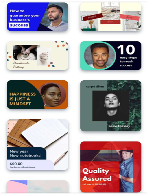
Stunning Poster Templates You May Use To Create and Share on Social Media

Social media engagement is hiking up and with that requirement of amazing and stunning content too. There is a constant need for outstanding content to attract people on social media accounts like Facebook, Instagram, and Pinterest etc.

Using poster templates is a unique and so easy way of grabbing the viewer’s attention.

It has been found that Facebook images receive 2.3× more engagement than normal text. To add to this, Twitter posts with images get 150% more retweets than usual.

So, check out this article to find out stunning poster templates and its sources that you can edit and use and share on social media too.

What kind of Social media posts stand out?

Social media posts are such that attract attention of viewers readily. It should grab their attention and should be self explanatory. No one would stare linger than 3-4 seconds if they do not get an idea in first glance. Templates need to be highly attractive and informative at the same time.

Catchy and likeable content should be incorporated on templates to display information. As it is usually said, a picture paints a thousand words. Instead of writing long paragraphs, just add an image that depicts the same.

Create good looking images that stand out all other elements and just attract your viewers’ attention in seconds.

You wish to turn your account into a place that your target audience loves to come back to from time to time. For that you require new and attractive content too.

You cannot use those boring, old stock images all the time. They do not convey exact message that you want to. Moreover, stock images are so vague and boring at the same time. No one even looks at them for 1 second, they just scroll down.

How to make Posts Attractive?

For you social media to stand out, you need amazing and attractive social media templates. The social media images must be ready to share and created in just a few minutes. Spending too much time on one image will not be worth. Reason behind this is short life of social media posts. They will not last long, therefore, do not give too much time to them.

It doesn’t requires hundreds and thousands of dollars to create stunning posts

You can get editable poster templates online. These templates are customizable and attractive. In just one click, you can share your designs on different social networking sites.

All you need to take care of is, create content that stands out and is unique. Using templates as it is can affect your social media status badly.

Furthermore, there are no rules or regulations regarding designing and using social media templates. You can let your creativity work and see the results yourself. Using these amazing templates can provide a new face to your social media accounts.

Creating stunning designs can be possible with various tips and tricks and some of them are mentioned here-

Features of Stunning Templates

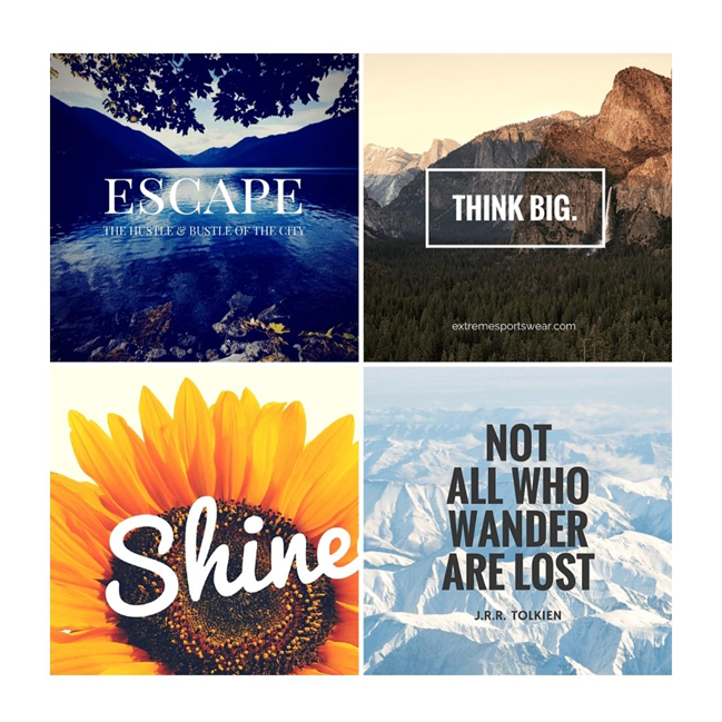
1. Contemporary and Bold Layout– Pick out a simple layout and convert it into something unique and attractive. This requires you to choose a bold and contemporary design. This helps is making the text jump out in a simple background and layout. Moreover, this tip is really trending in 2021.

2. Use colour overlaps- In top notch pictures or backgrounds, it can be a little hard sometimes to make text stand out and read. So, as a solution to this you can opt colour overlaps. This is a feature that blinds the background but not completely. You will display background as much is required. This trick can help you to deliver a bold message in an interesting manner. Perfect background stays at its place and let’s text stand out.

3. Use leading lines– It happens sometimes that designers fail to attract the attention of viewers to the main point. In that case, leading lines are a saviour. You can attract potential audience’s attention to focal points by adding leading lines. Otherwise, your target audience may just miss that focal point and you can suffer a great loss because of it.

4. Eye catching background– For conveying messages to the audience, using text on a plain background is a disaster. No one will be attracted to such a piece.  Using poster templates can help you out in this process. Just find amazing and attractive templates online that match with your theme and goal. Use that template to reach your goal. Templates have stunning and mesmerising backgrounds that can be of great value to you.

5. 2 Toned Title– This helps you to create or design something that is better and an upgraded version of simple templates. It pops from the background and compels viewers to have a look at what you wish to show. This technique attracts great attention instantly.

6. Bold colour scheme– In 2021, using bold palettes is trending. Pale and soft tones are a thing of the past now. Using numerous bold statements colour attracts attention and is so powerful and brave. You just need to know how to use bold colours and incorporate them in your style.

7. Custom Icon– You would have definitely come across hundreds of icons online. Why not use them for your social media. Combine a lot of theme icons and create one big icon. It is bound to attract people and think about your design. Moreover, it is undoubtedly creative and unique.

8. Consistent margin– Keeping content in a consistent margin makes you post clear and easy to understand. The message can be conveyed more clearly and easily in this manner. Moreover, this adds a professional touch to your content too. With numerous colours, fonts, images, shapes, your message can get mixed up a little. But presenting it in a clean and clear way can be really helpful to keep things on track.

9. Creative posters– Just let your creativity soar and scribble it all down on paper. Choose what fits your theme and style and just add it to your posts. Designing with creativity doing the main job creates most engaging and emotional posts. It allows you customers to feel and understand what you have to say.

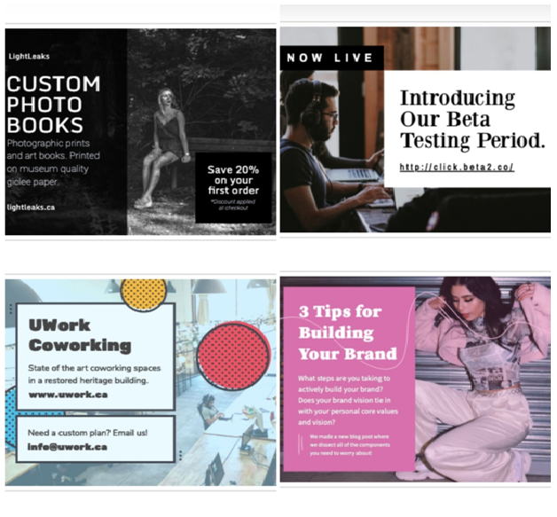
10. Use blocks to organise– in case content in one template is too much. You require something that helps to keep all different elements distinguished from others. They should not get mixed up. Therefore, using blocks is really helpful in this situation. It creates a margin between one element and another. Thus, viewers can easily understand the message without getting confused and overwhelmed.

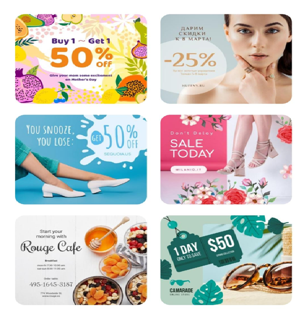
Now check out these stunning poster templates for your social media pages from these top platforms-

  • Canva- Canva is supposedly the best platform that has a huge variety of free poster templates for its users in huge categories. It can be for Instagram posts, Facebook cover, Twitter or Pinterest. You will get thousands of templates in each possible layout for social media accounts. This free platform is known for template based designing. You need to follow very easy and simple steps to customize templates for your needs. You can even add your own images or background to templates designs.
  • CrelloCrello is an ultimate platform with 20000+ templates for social media posts of different layouts. It has templates in various niches like food, technology, pets, travel, fashion, urban, still life, motion etc. You do not require any design skills to use templates provided on this website.

Image and font library of crello is so huge. It has 260+ fonts and you can use yours too. High quality photos are used in templates.

Create Image and post it in just a few minutes. This saves your time and is fun and easy too.

  • Snappa- This platform is known for creating images occasionally  It is a free website and premium versions come in $15/month. You can use the free version in case you need 3 posts only a month. For more posts, you will have to buy an upgraded version of snappa. All graphics, templates and other facilities are available in both the versions though. Creating designed templates is easy with amazing features. You can download or directly share it on social media platforms.
  • Desygner– Create your own designs with Desygner. It is free to use but charges 9.95 per month for next level creating and  editing. You can use it on desktop, android or iOS. This platform has many unique features. I’m case, you designed your work for an Instagram post but now you want to use it as a Facebook cover, you can simply change the layout. Desygner will automatically rearrange elements according to your requirement.

Further, along with amazing poster templates, you also.get editing tools to customize your work.

  • Adobe Spark– This is a popular platform and you must have heard of it sometime. It is amazing for people who wish to scale for side hustle. Numerous template designs are available here to readily use on social media websites. Dozens of layouts are provided for your use.

Use fonts, images and icons from huge libraries and create stunning and unique posts.

Conclusion These stunning poster templates are easy to create and share on social media accounts. Use these free poster templates to grab the attention of your audience and stand out in the competition.

Read More
Sanju February 2, 2021 0 Comments