Best Ways to Improve Your Content’s Design

When it comes to social marketing website design could play a crucial role. Digital marketing is growing very rapidly. You need to create your webpage to attract an audience and if you fail to create visually attractive content then it can affect your business growth. There are so many ideas you need to put while designing your content. Adding attractive colors, fonts, templates could attract your customers. There are various Graphic Design Services in the USA that are creating designs. Here we will talk about how you can impact your audience by designing a visually attractive design for your webpage. You don’t have to make it complicated. A little bit of changes can make your design look very classic and appealing. Let’s look at some of the ideas you can use while designing your content.
Color
Color has a psychological effect on the viewers. It can attract your audience and give an appealing view of your design. You don’t have to be too harsh with the color scheme you choose. Too much color can even ruin your design, keep it light and choose accordingly. You need to remember that color can affect vision and can justify your ideas. Choosing the right color palette for the viewers will give your design a completely new look. Playing with the color palette is an option available at your dispense. Your color should not be too harsh for the eyes as you know who may visit your website and what effect could it cause to their vision. Keep the right contrast with the words and background.
White Space
White space or we can even say negative space plays a crucial role when it comes to design a webpage. White space is simply leaving a white background or any other color. It makes a pleasing look for your design. It can help the viewer to give a better reading experience. Many companies embrace white space as their design. Apple is one of the best examples who use white space for its design. You have to choose your negative space wisely. It’s not like just leaving a small space to give a space for your content but you should know the purpose behind it and what you want to deliver to your customers.
Mobile-Friendly
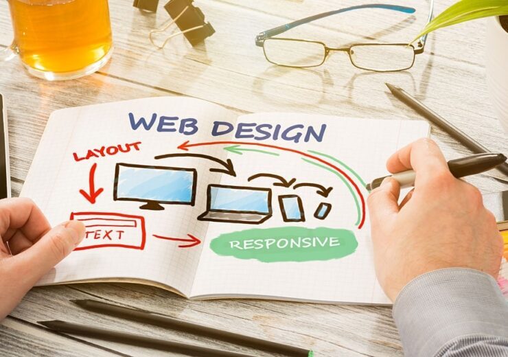
In today’s world smartphones are the handiest device to access anything anywhere. In this case, your website needs to be mobile friendly as most of your audience will be generated from smartphone users. If your website is not made for mobile users, then you might lose the audience and will affect your business growth. It will also affect the SEO of your website. All the features that you are providing for a desktop user should be equally available for mobile users. If your website is lagging and doesn’t respond to the users, then you already lost many of your audience.
Fonts
When it comes to designing your webpages words are very important to shape your ideas. Simple words can attract a wide range of audience, don’t try to overdo your text. Your text should be small and readable by the viewers. You don’t have to use too many classic fonts just stick around to 2-3 fonts. That will make your design look simple but eye-catching over using text can ruin your design. Just don’t forget to convey your message to your viewers. Some fonts may not work with your design to choose the font that can fit in your design.
Aligning
You want to make your design look clean and appealing. Aligning your design plays a huge role in attracting your audiences. Make sure everything in your design is well aligned. The fonts, the background, and all the images and text you add to your design. Keeping everything aligned in your design will make it look well designed. There are various kinds of text alignment which you can use in your design to give your text a better design. It balances your design and makes it easy for the viewer to have a better understanding.
Visual Effect
Visual elements like images and templates will support your design very well. All your elements should have a logic behind and why you are using the following element. It will make it easy to understand and will give your design some good effect. Visual elements will work with your fonts, color, and all the other elements you added to your design. Make sure all the elements are well justified and aligned. Your design should convey your ideas to your viewers. You can put your business logo and some images that will make it easy for your viewers to convey the thoughts you want to deliver.
You can use various techniques to improve your content designing. But these were a few of the important and simple ideas you can use while designing your webpage. Content design marketing is really growing and there is a huge competition in this area so if you want to stand out from all the other content design ideas you need to implement your ideas. Content marketing is a very huge marketing strategy. Create a user-friendly website for your viewers and it will also help you to increase the SEO of your webpage. Graphic design services in the USA are creating a lot of content design and increasing the business market. The future of content designing is bright and if you are planning to design your own content you need to keep all the important points in mind before creating a design. You need to make a plan and choose your audience. The right design will attract the right viewers.


