How to Create a User-Friendly Website: A Step-by-Step Guide
A good website is the need of every business, blog, e-commerce site, and personal portfolio in today’s digital world. A website is a virtual storefront. Its usability influences the user experience, which then leads to high engagement, conversion, and satisfaction. A user-friendly website does not only attract visitors but also asks them to linger longer and come back. This procedure-oriented guide might lead to an ordinary but both aesthetically beautiful and friendly website only because you thought about one step to get that design idea of yours concerning a website.
Step 1: Define Your Purpose for Designing a Web Site
————————————
Before the website design and functionality, it is quite important to outline the purpose of your website. The knowledge of the aim of the website will define all the user experiences and help decide on the aspects of design, layout, and content. Major purposes of websites differ and might be:
- Business Websites: Information about the company, its products, and services.
- E-commerce Websites: Direct selling of products or services to consumers.
- Blog Websites: Share personal stories, opinions, and informative articles.
- Portfolio Websites: Showcase your work, such as photography, design, or writing.
- Community or Social Websites: Facilitate interaction between users on specific topics.
Having a clear idea of your website’s purpose will guide your design and functionality decisions moving forward.
Step 2: Plan the Structure and Content
————————————
Plan the website structure. That will be a model to aid in navigation from a user perspective. A website that is structurally sound gives the user something easy to seek what they’re looking for within it. Do this by:
- Create a Site Map: A site map is a visual map of the website’s pages and how they connect. Common pages found on most websites include the home page, about page, services/products page, blog, contact page, etc.
- Key Pages Should be Easily Accessible: Your most important pages should be easily accessible. For instance, the homepage should have a value proposition and the contact page should be easily found.
- Content: This is what will attract and retain the users. Always write clear content that is engaging and relevant to your target audience. Make it concise through headings, bullet points, and even visuals through better scannability
Step 3: Website Platform
————————————
Once you know what you want to build and of what, then you can choose which software you want to make a website with. But there are also several options for building a website, tailored for the needs and knowledge of everyone:
Website Builders : Wix, Squarespace, and Weebly use drag-and-drop features without too much code programming. Good for those looking for a simple tool that will help them build simple yet very useful websites really fast.
Content Management Systems or CMS: It is WordPress, which offers a lot of customization options along with many more different plugins and is used on the majority. WordPress is actually best for someone who needs so much flexibility, control over designing and functionality at their site and may take sometime to learn more.
E-commerce Platforms: If you are going to have an online store, there are dedicated e-commerce platforms like Shopify, WooCommerce, and BigCommerce that will allow you to manage products, payments, and inventory.
Custom Development: If you need a very unique or complex one, you should hire a developer to build a custom website for your site. This type of approach offers you the greatest level of control but requires the largest budget and most time.
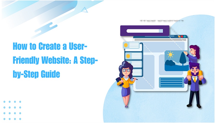
Step 4: Choose a Clean, Responsive Design
————————————
A user-friendly website should be aesthetically pleasing and easy to navigate. For a website development company in Jaipur, look for simple and clear choices. Here are some things to consider:
- Clean Layout: Do not overcrowd. A clean, well-organized layout enables users to locate information easily. Group related items together and apply a consistent design throughout the site.
- Visual Hierarchy: It is done through font sizes, colors, and space, which tells what the eyes should look at first, like calls to action, headings, and key content.
- Responsive Design: With the increasing users accessing websites on their cell phones, it is very much important to choose a responsive design that adapts itself on different screen sizes. A mobile-friendly website ensures an uninterrupted user experience on smartphones and tablets.
- Load faster: long-loading pages annoy customers and do not make for great business, and this means big bounce rates; compress your images, lighten some heavy scripts and have some cache so your pages load up
Step 5: Use and Navigation
————————————
Navigation is one of the basic things of a user-friendly website. In case a user cannot find what he wants at the right time, there are chances that he will leave instantly. Here are a few guidelines about an easy navigation system:
- Simple Menu: The main navigation menu of your website should be simple and straightforward. It has only the necessary pages of your website. These are the home page, services/products, about, and the contact pages.
- Logical Flow: The structure of your website should also be logical. Related pages must go together. Users must not have to go too far in order to find what they want.
- Sticky Navigation: Provide for sticky navigation menus that stick on top of the page while navigating to ensure other pages can easily be accessed without scrolling up.
- Search Function: It provides for a search bar that easily enables navigation. It is particularly essential for larger sites with many pages because it can be navigated easily to locate something.
Breadcrumbs Breadcrumbs also provide extra navigation; this helps make it clear to a user where the user is. This is a means of communicating with the visitor how they fare among the levels that make the site and in the event also easily navigate backwards through previous pages.
Step 6: Search Engine Optimization
————————————
This means that it ensures that your users’ website is highly ranked in the search through Google so that it becomes accessible to potential users of the website. Optimizing a website for SEO includes the following areas:
- Keyword Research: It identifies related keywords that your target audience can use to reach your products, services, or information and incorporates them naturally into page titles, headings, URLs, and content.
- Content optimization: answers that give user’s value with added related images or videos from which they would love to obtain such value.
Alt texts on images are the descriptions done in case they could not read but still in good SEO manners.
- Meta Descriptions: Write clear and concise meta descriptions for all pages. The text users will see in the search engine results below your page title, make it appealing and enticing to receive clicks.
- Mobile Optimization: Google favors mobile-friendly sites. Your website should be responsive and gives the best experience on mobile. This will make your SEO shoot up.
Step 7: Add Calls to Action
————————————
Calls to Action are the most important for making users do something next: maybe buy something, fill out a contact form, or subscribe to a newsletter. Here is how to make good calls to action:
- Clear and Actionable: Use action-oriented language such as “Buy Now,” “Get Started,” “Learn More,” or “Contact Us.”
- Position CTAs Appropriately: Place your CTAs in the most conspicuous positions of the page. Do this on the top page, after segments of content, or even towards the bottom of your blog post or product descriptions.
- Use Color Contrasts: Give your CTAs an appearance of difference through the use of color contrasts, but which don’t stray away from your site’s theme and overall design.
Step 8: Testing and Launch of Your Website
————————————
Test your website on multiple devices and browsers before launching it live. Confirm that the most common web browsers, such as Chrome, Firefox, Safari, and Edge, still have your site up and running without flaws. Ensure responsiveness across multiple screens for a smoother user eUser Feedback: Engage in the practice of asking users about their experience frequently and improving based on user suggestions.
- A/B Testing: Test varied designs, layouts, or CTAs for your website to see which yields the best results.
- Update Content: Constantly update the content on your website to make it meaningful and relevant to the visitors.
- experience in every device: Functionality Testing Tests all your links, buttons, forms, and CTAs for proper working.
- Loading Speed: Use online tools, such as Google PageSpeed Insights, to benchmark your website’s speed and modify as necessary.
Now that everything is tested and working, it’s time to launch the website.
Step 9: Monitor and Improve
————————————
This is just the starting point: a website should be built and, after launching, should be monitored in order to be continually improved with respect to user feedback and analytics data. Google Analytics can be helpful in tracking users’ behavior, popular content, and where improvements can be made.
A user-friendly website requires careful planning, Usa Web Development Company, and continuous optimization. With the steps involved here-from defining your website’s purpose, choosing the right platform, focusing on design and navigation, optimizing for SEO, and continuously improving-you will create a website that gives a wonderful user experience and fulfills business objectives. Be it building a simple blog or an extended e-commerce site, a user-friendly website is a crucial tool to engage visitors and drive success.